

This project has been an interesting adventure into my ability to describe things down to the smallest details. When I first decided to explore agentic AI, I knew my first prompt would be the cornerstone of the entire project, and that if it was not good, the rest of the project would fall behind. However, while I have experience prompting AI for things like essay grading or script inspiration, this was my first time prompting AI for code. So I decided which resources I had to fine-tune my prompts and realized the solution was right in front of me: AI.
My workflow quickly materialized as I spent a long time identifying what needed to change and which small differences stood out. Then I would take my potential prompt and ask ChatGPT where it needed fine-tuning. However, I do want to make it abundantly clear that this process was still largely human-driven. I wrote all the prompts by hand before using AI to edit and refine them. Additionally, I did not just blindly follow everything ChatGPT said to do. I made sure that it was still in line with my vision, as this was not its project; it was mine. Through this process, I learned a lot about the importance of precision when prompting AI; if I were too broad, the agentic AI (Replit) would be more likely to take certain liberties.
With this workflow, I was able to produce and edit prompts in a way that saved credits, since I have more free uses of ChatGPT than Replit. So, by first editing and reworking many prompts, I found I had very accurate results across all my work. As I progressed through the project, my prompting improved significantly as I learned. It almost felt like learning a new accent. Which, while it sounds odd, I think it best describes the process of learning to prompt, because while I am speaking in plain English, the tone, sentence structure, and phrasing change significantly, just like they do between someone from London and someone from Tallahassee, Florida.
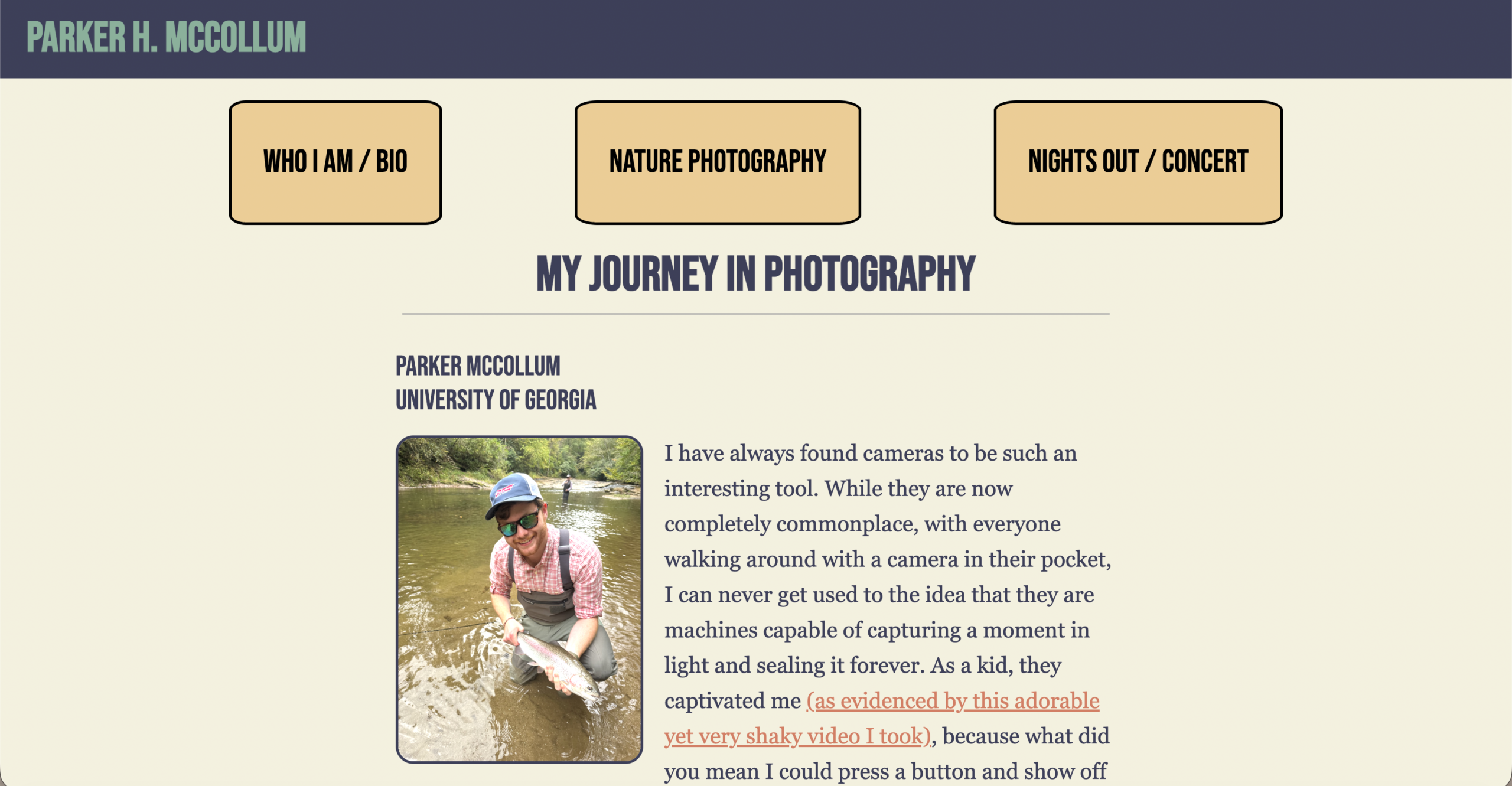
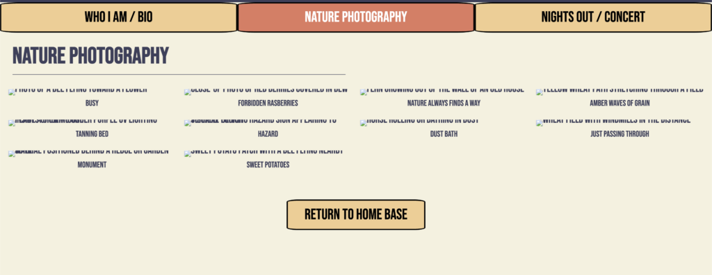
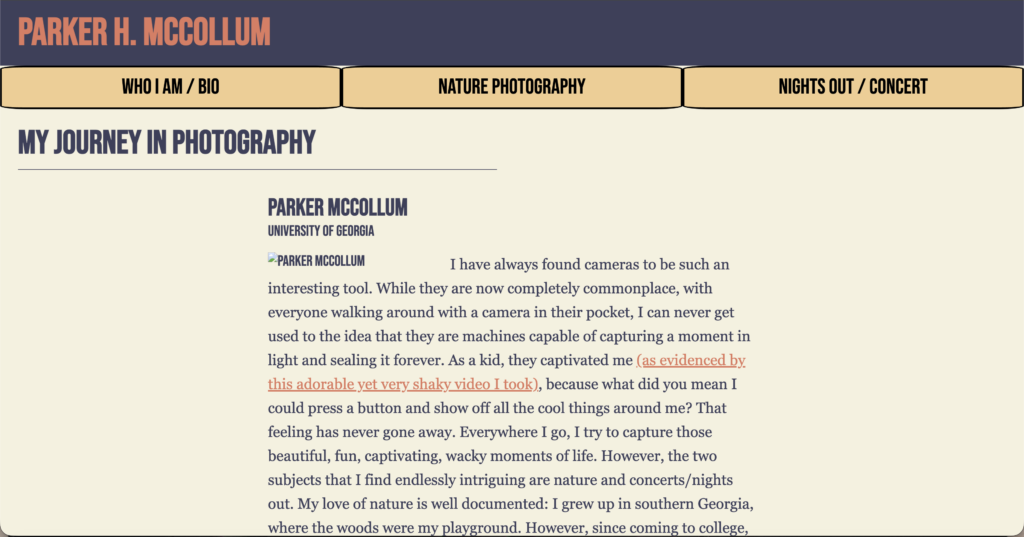
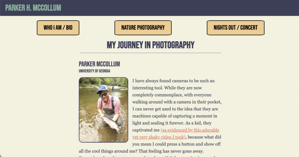
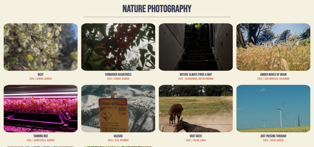
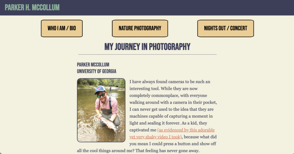
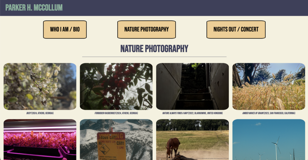
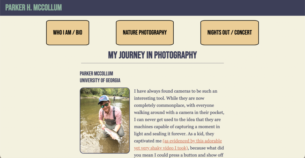
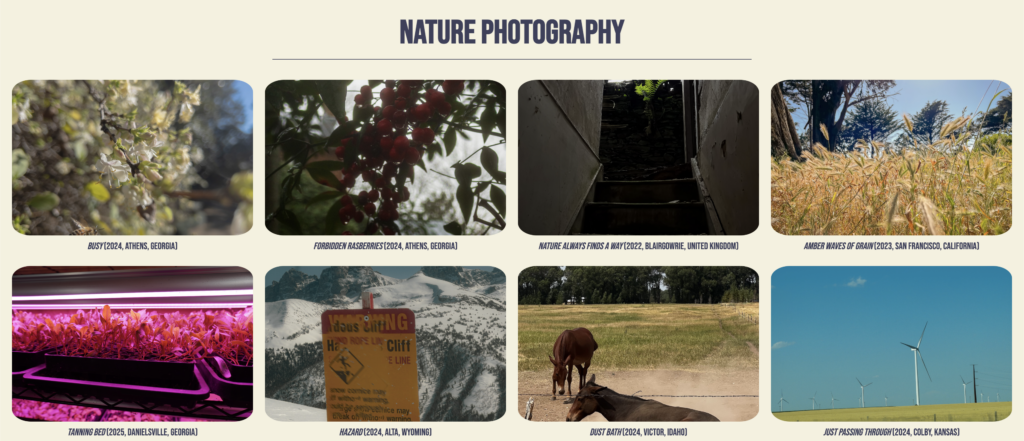
But the moment that surprised me the most during this project was the result of my first prompt, as it was remarkably similar to my website. I think I audibly gasped when it first loaded. While there were certainly issues that needed fixing, I could already see that the majority of the work was done in one prompt. The following prompts were largely focused on fixing minor style errors, such as the wrong header color, the shape and spacing of the Nav Bar, a few captioning issues in the photo section, and the centering of the section title. However, even without any uploaded photos, I could see my original website almost intact in front of me.
After the initial version, I uploaded all project photos and prompted to resolve the remaining issues from the first iteration. I repeated this process a few times until, in about four prompts, I had a website nearly identical to my first project. However, I still had concerns. I felt uneasy, worried that one incorrect prompt could ruin the project like glass shattering. I now better understand that AIs are tools, not solutions. If it were for a client or my personal site, I’d be more nervous to trust it completely, as I don’t understand the underlying code. Making changes or additions would be challenging since I’m largely unaware of the behind-the-scenes code.
Presentation Video:
Prompts / Documentation:
Links:
- ChatGPT Chatlog: https://chatgpt.com/share/69f903f5-ab2c-83ea-8100-9fd84282d3f7
- First Version: https://c00ae1e5-12cb-4520-9d38-2be84f30c148.spock.prod.repl.run/index.html
- Final Version: https://asset-replicator–SniperOfTheSEA.replit.app
- Original Project One: https://parkerhmccollum.com/webdev/project-one/
Prompts used:
Prompt 1: Original
I need to create a website with the specific parameters listed below. Please follow all directions as directly as possible. Below, I will list the required elements in several sections, each of which must be followed to put the website together. I will list the elements on each page, starting with the topmost elements and moving down. This Website will have three pages with certain elements consistent across them. To note a separate page, instructions will have a ###.
CSS:
Globally, no padding or margins ALL TEXT ACROSS UNLESS SPECIFICALLY NOTED OTHERWISE WILL USE: BEBAS NEUE (INSTALLED THROUGH GOOGLE FONTS).
Colors to be used across the site:
Old Cream: #F4F1DE
Dark Blue: #3D405B
Teal: #81B29A
Rust Red: #E07A5F
Tan: #F2CC8F
All photos should grow by 1.5 whenever the mouse hovers over them.
Background Color: Old Cream
All pages: (All pages will have these two elements before anything else)
Header: Text: Parker H. McCollum Element Type: H1 Style: Background color: Dark Blue: Text Color: Accent Alignment: Left-aligned Nav Bar: Text: (Varies per button as is listed in description below). Element type: a Style: Background color: Tan: Border: 3px thick, solid, #000 Border radius: rounded Text align: center Font size: 36px
Description: There should be three identical boxes that link to each webpage. They should be in a flex box row. The first box will read: Who I am / Bio. The Second box will read: Nature Photography. The Third box will read: Nights Out / Concert. Home button:
At the very bottom of every page, there should be a small button that follows the style of the Nav Bar; however, it will read “return to home base” and will link to Page One.
Page One:
After the heading and Nav bar:
Large heading with Dark Blue color that reads “My Journey in Photography”. After that, there should be a small lower margin followed by a small thin dividing line. Below the line is a medium sized heading: “Parker McCollum” which is stacked on top of the text “University of Georgia” both of which use the color Dark Blue. Below is a paragraph of text that wraps around a left-aligned image under the filename “bio”. The paragraph is made up of text with a simple serif font. The paragraph text is as follows: I have always found cameras to be such an interesting tool. While they are now completely commonplace, with everyone walking around with a camera in their pocket, I can never get used to the idea that they are machines capable of capturing a moment in light and sealing it forever. As a kid, they captivated me [This is a note not to be included in the text of the paragraph the following text in parentheses needs to link to a video file by the name of “VID00030_1.mov” to open in a blank page.] (as evidenced by this adorable yet very shaky video I took), because what did you mean I could press a button and show off all the cool things around me? That feeling has never gone away. Everywhere I go, I try to capture those beautiful, fun, captivating, wacky moments of life. However, the two subjects that I find endlessly intriguing are nature and concerts/nights out. My love of nature is well documented: I grew up in southern Georgia, where the woods were my playground. However, since coming to college, I have found a new subject I love: concerts and street photography of nights on the town. While it may seem odd at first to combine the two, they share many similarities. Concerts and nights out are both full of loud music, flashing multicolored lights, group dynamics, and enough alcoholic beverages to let people drop their guard. So take a glance through my gallery and see if you can find a new favorite picture!”
### Page Two:
After the heading and Nav bar:
Large heading with Dark Blue color that reads “Nature Photography”. After that, there should be a small lower margin followed by a small thin dividing line. After that, there will be a gallery of 10 responsive images inside a flexbox. Each image has its own caption that sits below it and will follow it even if it moves due to a change in browser size. All images should have slightly rounded borders. The images and captions are listed below and should appear in the order listed. The information for each photo will be listed like so: Image.jpg — “Title” — alt text (year, location) and separated by a /. bee.jpg — “Busy” — photo of a bee flying toward a flower (2024, Athens, Georgia) / berries.jpg — “Forbidden Rasberries” — close-up photo of red berries covered in dew (2024, Athens, Georgia) / fern.jpg — “Nature Always Finds a Way” — fern growing out of the wall of an old house (2022, Blairgowrie, United Kingdom) / grass.jpg — “Amber Waves of Grain” — yellow wheat path stretching through a field (2023, San Francisco, California) / greenhouse.JPG — “Tanning Bed” — plants growing under purple UV lighting inside a greenhouse (2025, Danielsville, Georgia) / hazard.jpg — “Hazard” — surreal-looking hazard sign appearing to visually glitch (2024, Alta, Wyoming) / horses.jpg — “Dust Bath” — horse rolling or bathing in dust (2024, Victor, Idaho) / passingThrough.jpg — “Just Passing Through” — wheat field with windmills in the distance (2024, Colby, Kansas) / sundial.jpg — “Monument” — sundial positioned behind a hedge or garden wall (2023, Athens, Georgia) / sweetPotatos.JPG — “Sweet Potatoes” — sweet potato patch with a bee flying nearby (2025, Danielsville, Georgia).
### Page Three:
After the heading and the Nav bar:
Large heading with Dark Blue color that reads “Nights Out / Concert”. After that, there should be a small lower margin followed by a small thin dividing line. After that, there will be a gallery of 10 responsive images inside a flexbox. Each image has its own caption that sits below it and will follow it even if it moves due to a change in browser size. All images should have slightly rounded borders. The images and captions are listed below and should appear in the order listed. The information for each photo will be listed like so: Image.jpg — “Title” — alt text (year, location) and separated by a /. arena.jpg — “Stage Presence” — large crowd gathered at a concert or arena performance (2024, Atlanta, Georgia) / gossip.jpg — “Gossip” — students leaning into a doorway while talking quietly together (2024, Athens, Georgia) / singing.jpg — “Dream Come True” — musician in the center playing guitar and singing onstage (2025, Athens, Georgia) / thumbsUp.jpg — “Thumbs Up” — person giving a thumbs up inside a crowded bar (2024, Athens, Georgia) / starstruck.jpg — “Starstruck” — man in a suit staring into bright club lights (2025, Oxford, United Kingdom) / neon.jpg — “Huh?” — chaotic neon-lit bar scene full of motion and energy (2024, Athens, Georgia) / back2Back.jpg — “You get me” — two musicians performing back-to-back onstage (2025, Athens, Georgia) / what.jpg — “*#$@& please” — confused man talking to someone in a noisy bar environment (2024, Athens, Georgia) / ernest.jpg — “Supernova” — musician performing live onstage under concert lighting (2023, Athens, Georgia) / speakNoEvil.jpg — “Speak No Evil” — musician performing live onstage during a concert (2025, Athens, Georgia)
Prompt 1: (POST AI SUGGESTED EDITS)
IMPORTANT:
This project is intended to replicate an existing hand-coded website as closely as possible. Prioritize accuracy and fidelity over creativity. Do not redesign or modernize the layout unless explicitly instructed.
Project File Structure:
– index.html = Home/Bio page
– nature.html = Nature Photography page
– concert.html = Nights Out / Concert page
– style.css = global stylesheet
Image folders:
– img/nature/
– img/concert/
– img/bio/
Video file:
– media/VID00030_1.mov
Project Description: I need to create a website with the specific parameters listed below. Please follow all directions as directly as possible. Below, I will list the required elements in several sections, each of which must be followed to put the website together. I will list the elements on each page, starting with the topmost elements and moving down. This Website will have three pages with certain elements consistent across them.
## Implementation Requirements:
– Use semantic HTML5 elements where appropriate.
– Use external CSS in style.css.
– Do not use inline CSS unless absolutely necessary.
– Do not use frameworks like Bootstrap or Tailwind.
– Use only HTML and CSS unless JavaScript is required.
– Do not generate placeholder images, placeholder text, lorem ipsum, or additional sections beyond what is specified.
## Accessibility Requirements:
– All images must include alt text.
– Navigation links must be clearly readable.
– Maintain sufficient color contrast.
– Use semantic heading hierarchy.
## Global Styling
- Globally, no padding or margins
- ALL TEXT ACROSS UNLESS SPECIFICALLY NOTED OTHERWISE WILL USE: BEBAS NEUE (INSTALLED THROUGH GOOGLE FONTS).
- Colors to be used across the site:
- Color Usage:
- – Background: Old Cream (#F4F1DE)
- – Header background: Dark Blue (#3D405B)
- – Main headings: Dark Blue
- – Navigation buttons: Tan (#F2CC8F)
- – Accent/highlight color: Rust Red (#E07A5F)
- – Optional secondary accents: Teal (#81B29A)
- All images should slightly enlarge on hover using CSS transform: scale(1.5).
- Background Color: Old Cream
- Typography Font-sizes:
- – H1: 64px
- – H2: 55px
- – H3: 40px
- – Body text: 25px
- – Image captions: 20px
Use CSS classes consistently for reusable elements such as:
– navigation buttons
– image containers
– captions
– section headings
## Shared Components
All pages: (All pages will have these two elements before anything else)
Header:
- Text: Parker H. McCollum
- Element Type: H1
- Style:
- Background color: Dark Blue:
- Text Color: Accent
- Alignment: Left-aligned
Nav Bar:
- Text: (Varies per button as is listed in description below).
- Element type: a
- Style:
- Background color: Tan:
- Border: 3px thick, solid, #000
- Border radius: 8%
- Text align: center
- Font size: 36px
- Description: There should be three identical boxes that link to each webpage. They should be in a flex box row. The first box will read: Who I am / Bio. The Second box will read: Nature Photography. The Third box will read: Nights Out / Concert.
- Navigation Links:
- – “Who I am / Bio” links to index.html
- – “Nature Photography” links to nature.html
- – “Nights Out / Concert” links to concert.html
Home button:
A centered button should appear at the bottom of the page content, before the footer area, following the style of the Nav Bar; however, it will read “return to home base” and link to Page One (index.html)
## Page One
After the heading and Nav bar:
Large heading with Dark Blue color that reads “My Journey in Photography”. After that, there should be a 10px margin followed by a small thin dividing line 800px in length. Below the line is a medium sized heading: “Parker McCollum” which is stacked on top of the text “University of Georgia” both of which use the color Dark Blue. Below is a paragraph of text that wraps around a left-aligned image under the filename “bio”(Bio image file path:img/bio/bio.jpg)
. The paragraph is made up of text with a simple serif font. The paragraph text is as follows: I have always found cameras to be such an interesting tool. While they are now completely commonplace, with everyone walking around with a camera in their pocket, I can never get used to the idea that they are machines capable of capturing a moment in light and sealing it forever. As a kid, they captivated me [This is a note not to be included in the text of the paragraph the following text in parentheses needs to link to a video file by the name of “VID00030_1.mov” to open in a blank page.] (as evidenced by this adorable yet very shaky video I took), because what did you mean I could press a button and show off all the cool things around me? That feeling has never gone away. Everywhere I go, I try to capture those beautiful, fun, captivating, wacky moments of life. However, the two subjects that I find endlessly intriguing are nature and concerts/nights out. My love of nature is well documented: I grew up in southern Georgia, where the woods were my playground. However, since coming to college, I have found a new subject I love: concerts and street photography of nights on the town. While it may seem odd at first to combine the two, they share many similarities. Concerts and nights out are both full of loud music, flashing multicolored lights, group dynamics, and enough alcoholic beverages to let people drop their guard. So take a glance through my gallery and see if you can find a new favorite picture!”
Layout / Sizing
Desktop:
– Main text content should occupy approximately 50% of the viewport width and remain centered.
Mobile:
– Content should expand appropriately for readability with reduced side margins.
## Page Two
After the heading and Nav bar:
Large heading with Dark Blue color that reads “Nature Photography”. After that, there should be a 10px margin followed by a small thin dividing line 800px in length. After that, there will be a gallery of 10 responsive images inside a flexbox. Each image has its own caption that sits below it and will follow it even if it moves due to a change in browser size. All images should have 8% rounded borders. The images and captions are listed below and should appear in the order listed. The information for each photo will be listed like so: Image.jpg — “Title” — alt text (year, location) and separated by a /. bee.jpg — “Busy” — photo of a bee flying toward a flower (2024, Athens, Georgia) / berries.jpg — “Forbidden Rasberries” — close-up photo of red berries covered in dew (2024, Athens, Georgia) / fern.jpg — “Nature Always Finds a Way” — fern growing out of the wall of an old house (2022, Blairgowrie, United Kingdom) / grass.jpg — “Amber Waves of Grain” — yellow wheat path stretching through a field (2023, San Francisco, California) / greenhouse.JPG — “Tanning Bed” — plants growing under purple UV lighting inside a greenhouse (2025, Danielsville, Georgia) / hazard.jpg — “Hazard” — surreal-looking hazard sign appearing to visually glitch (2024, Alta, Wyoming) / horses.jpg — “Dust Bath” — horse rolling or bathing in dust (2024, Victor, Idaho) / passingThrough.jpg — “Just Passing Through” — wheat field with windmills in the distance (2024, Colby, Kansas) / sundial.jpg — “Monument” — sundial positioned behind a hedge or garden wall (2023, Athens, Georgia) / sweetPotatos.JPG — “Sweet Potatoes” — sweet potato patch with a bee flying nearby (2025, Danielsville, Georgia).
## Image Responsive Requirements
– Galleries should use flexbox with wrapping enabled.
– Images should remain consistent despite screen width.
– Desktop layout: approximately 4 images per row.
– Tablet layout: approximately 2 images per row.
– Mobile layout: 1 image per row.
– Captions must remain attached directly below their corresponding image.
## Each gallery item should:
– Be contained in its own div
– Include an image element
– Include a caption directly beneath the image
– Maintain alignment when wrapping across rows
## Page Three
After the heading and the Nav bar:
Large heading with Dark Blue color that reads “Nights Out / Concert”. After that, there should be a 10px margin followed by a small thin dividing line 800px in length. After that, there will be a gallery of 10 responsive images inside a flexbox. Each image has its own caption that sits below it and will follow it even if it moves due to a change in browser size. All images should have 8% rounded borders. The images and captions are listed below and should appear in the order listed. The information for each photo will be listed like so: Image.jpg — “Title” — alt text (year, location) and separated by a /. arena.jpg — “Stage Presence” — large crowd gathered at a concert or arena performance (2024, Atlanta, Georgia) / gossip.jpg — “Gossip” — students leaning into a doorway while talking quietly together (2024, Athens, Georgia) / singing.jpg — “Dream Come True” — musician in the center playing guitar and singing onstage (2025, Athens, Georgia) / thumbsUp.jpg — “Thumbs Up” — person giving a thumbs up inside a crowded bar (2024, Athens, Georgia) / starstruck.jpg — “Starstruck” — man in a suit staring into bright club lights (2025, Oxford, United Kingdom) / neon.jpg — “Huh?” — chaotic neon-lit bar scene full of motion and energy (2024, Athens, Georgia) / back2Back.jpg — “You get me” — two musicians performing back-to-back onstage (2025, Athens, Georgia) / what.jpg — “*#$@& please” — confused man talking to someone in a noisy bar environment (2024, Athens, Georgia) / ernest.jpg — “Supernova” — musician performing live onstage under concert lighting (2023, Athens, Georgia) / speakNoEvil.jpg — “Speak No Evil” — musician performing live onstage during a concert (2025, Athens, Georgia)
## Image Responsive Requirements
– Galleries should use flexbox with wrapping enabled.
– Images should remain consistent despite screen width.
– Desktop layout: approximately 4 images per row.
– Tablet layout: approximately 2 images per row.
– Mobile layout: 1 image per row.
– Captions must remain attached directly below their corresponding image.
## Each gallery item should:
– Be contained in its own div
– Include an image element
– Include a caption directly beneath the image
– Maintain alignment when wrapping across rows
## Output Requirements:
Please generate:
– index.html
– nature.html
– concert.html
– style.css
If any instruction is unclear, prioritize preserving the original layout and visual hierarchy rather than inventing new design elements.
Ensure all pages are linked correctly and all image paths are functional.
AFTER THIS POINT PHOTO AND VIDEO FILES WERE ADDED TO REPLIT
Prompt 2:Original
Header: The text for the header should use the Teal (#81B29A) and it should be smaller.
There should also be a gap between the header and the Nav Bar. Nav Bar
The nav bar buttons should have more space between each other and be taller.
When hovering over the buttons on the nav bar the background color should remain the same but the text turns Rust Red (#E07A5F). (ONLY ON HOVER)
The same applies to the “Return to Homebase” Button.
Section head: On all pages where the page title is i.e. “My Journey in Photography”, “Nature Photography”, and “Nights Out / Concert” should be centered. The line under this text should also be centered.
## Page One:
The text Parker McCollum and the University of Georgia should have the same font weight. The bio picture should have 8% rounded corners and a 3px, solid, Dark Blue (#3D405B) border.
## Page two:
All images, regardless of orientation(Vertical versus horizontal) should have roughly same shape.
Maintain rounded corners on the images.
When hovering over the images, the image should become larger on the screen not just within its image frame.
The Dates and locations are missing across all images.
## Page Three:
All images, regardless of orientation(Vertical versus horizontal) should have roughly same shape.
Maintain rounded corners on the images.
When hovering over the images, the image should become larger on the screen not just within its image frame.
The Dates and locations are missing across all images.
Prompt 2: (AI SUGGESTED EDITS)
Modify the existing HTML and CSS files rather than recreating the project from scratch. Preserve all existing structure and styling unless explicitly changed below.
Header:
- Reduce the header text size to approximately 48px and change the text color to Teal (#81B29A).
- Add approximately 25px vertical spacing between the header and navigation bar.
Nav Bar
- Increase navigation button padding vertically and horizontally and add approximately 200px spacing between each button.
- On hover:
- – navigation button backgrounds should remain unchanged
- – navigation text color should change to Rust Red (#E07A5F)
- – apply the same hover behavior to the “Return to Homebase” button
Section head:
- Center-align all page section titles including:
- – “My Journey in Photography”
- – “Nature Photography”
- – “Nights Out / Concert”
- The divider line beneath each title should also be horizontally centered.
## Page One:
- The text Parker McCollum and the University of Georgia should have the same font weight.
- The bio image should have:
- – 20px border radius
- – 3px solid border using Dark Blue (#3D405B)
## Page two:
- All gallery images should display in uniformly sized image containers regardless of original orientation.
- Requirements:
- – Maintain image aspect ratio
- – Use object-fit: cover
- – Images should appear visually consistent in size
- – Do not stretch or distort images
- When hovering over gallery images:
- – images should scale beyond their container boundaries
- – use CSS transform: scale()
- – hovered images should appear above surrounding content using z-index
- Do not clip enlarged hover images. Ensure parent containers allow hovered images to extend visibly beyond their normal bounds.
- Ensure all image captions include:
- – image title
- – year
- – location
- This information should appear beneath every gallery image exactly as specified in the original prompt.
## Page Three:
- All gallery images should display in uniformly sized image containers regardless of original orientation.
- Requirements:
- – Maintain image aspect ratio
- – Use object-fit: cover
- – Images should appear visually consistent in size
- – Do not stretch or distort images
- When hovering over gallery images:
- – images should scale beyond their container boundaries
- – use CSS transform: scale()
- – hovered images should appear above surrounding content using z-index
- Do not clip enlarged hover images. Ensure parent containers allow hovered images to extend visibly beyond their normal bounds.
- Ensure all image captions include:
- – image title
- – year
- – location
- This information should appear beneath every gallery image exactly as specified in the original prompt.
Prompt 3: Original
Modify the existing HTML and CSS files rather than recreating the project from scratch. Preserve all existing structure and styling unless explicitly changed below.
Header:
Ensure that the header runs all the way to the border of the website. Nav Bar Increase the vertical padding of the navigation button by 30px.
Decrease the spacing between buttons by approximately 30px.
## Page One:
The text Parker McCollum and the University of Georgia should have the same font size.
## Page two:
Ensure all image captions have this layout: – image title (in italics) – year – location
This information should appear beneath every gallery image exactly as specified in the original prompt. Additionally, the entire caption should be on one line.
Example: Image Title (Year, Town, County/State)
## Page Three:
Ensure all image captions have this layout: – image title (in italics) – year – location
This information should appear beneath every gallery image exactly as specified in the original prompt.
Additionally, the entire caption should be on one line. Example: Image Title (Year, Town, County/State)
Prompt 3: (AI EDITED)
Modify the existing HTML and CSS files rather than recreating the project from scratch. Preserve all existing structure and styling unless explicitly changed below.
Header:
- Ensure the header background stretches the full width of the viewport with no visible margins or gaps on the left or right sides.
Nav Bar
- Increase the top and bottom padding of navigation buttons to create taller buttons.
- Reduce the horizontal gap between navigation buttons by approximately 30px from the current spacing.
## Page One:
- The text Parker McCollum and the University of Georgia should have the same font size.
## Page two:
- Ensure all image captions have this layout:
- – image title (in italics)
- Only the image title should be italicized. The year and location should remain normal text.
- – year
- – location
- This information should appear beneath every gallery image exactly as specified in the original prompt.
- Ensure captions remain on a single line on desktop layouts while still remaining readable on smaller screens. Example: Image Title (Year, Town, County/State)
## Page Three:
- Ensure all image captions have this layout:
- – image title (in italics)
- – year
- – location
- This information should appear beneath every gallery image exactly as specified in the original prompt.
- Additionally, the entire caption should be on one line. Example: Image Title (Year, Town, County/State)
Prompt 4: Original
Nav Bar
Make it so the right and left most buttons are not touching the side of the website and bring all the buttons slightly closer together.
Make the buttons 20px taller
“Return to Home Base Button”
Change the size of the button so that it is two lines of text with the top line reading: return to and the second line reading: home base.
## Page two: Center the gallery so that any images left out of the main two rows are in the center of the website.
## Page Three: Center the gallery so that any images left out of the main two rows are in the center of the website.
Prompt 4: (AI EDITED)
Nav Bar
- Make it so the right and left most buttons are not touching the side of the website and bring all the buttons slightly closer together.
- Make the buttons 20px taller
“Return to Home Base Button”
- Change the size of the button so that it is two lines of text with the top line reading: return to and the second line reading: home base.
## Page two:
- Center the gallery so that any images left out of the main two rows are in the center of the website.
## Page Three:
- Center the gallery so that any images left out of the main two rows are in the center of the website.